Wish App Copy Challenge
Challenge
I completed a content strategy challenge where I suggested ways to improve the copy and design of the Wish app.
About the App
Wish is an e-commerce platform focused on affordability and a fun, discovery-based shopping experience.
They're all about exploration, and they want their app to be a source of entertainment, in addition to a source for shopping.
They really emphasize the affordability of their products. When you go to their product page, the low-low prices are front and center, which makes them a little bit different than other e-commerce sites.
My Role
I conducted a heuristic evaluation of the 3 screens below, followed by a 20-min usability test over Zoom with a friend who embodies Wish's target audience (In short, someone who is cost-conscious with the heart of an online window shopper).
Then, I created updated mock-ups with my copy and design recommendations.
Before
After
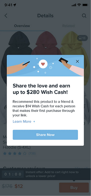
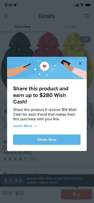
Screen 1
Critique
-
“Share” used 3 times
-
Headline has a widow
-
User was confused on whether friends have to purchase this exact product
What I Did
-
Shortened the headline to get rid of widow
-
Altered body copy to better imply that friends don't have to purchase this exact product (broadens the link-sharing process)
-
Made the tone less solict-y by changing "share this product" to "share the love"
Other Considerations
-
Share this product with up to 20 friends…
-
Tell your friends to check out Wish…
-
Spread the word about Wish & receive $14 for each friend who purchases something through your link…
Before
After
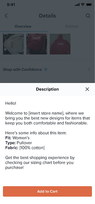
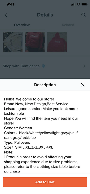
Screen 2
Critique
-
Needs better visual hierarchy
-
Grammar + spacing errors
-
Redundant + unnecessary information
-
User disliked the “Gender” category
-
User was confused on whether this is the only product in the store
What I Did
-
Improved readability + scannability
-
Cut repeat information (colors/sizes are available in their own tab on the same page that pulls up the description)
-
Replaced "Gender" with "Fabric" to improve relevancy of information
Before
After
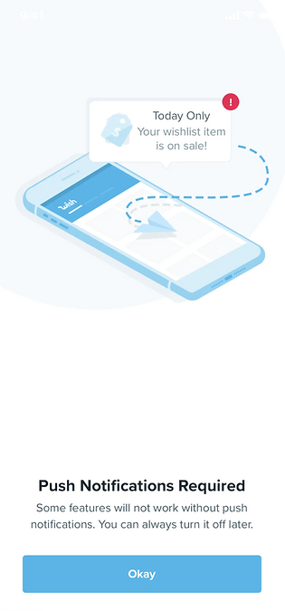
Screen 3
Critique
-
Are push notifications really required if you can always turn them off?
-
Tone is a bit abrasive/sketchy
-
This page should offer a way to customize notifications while they're having this conversation
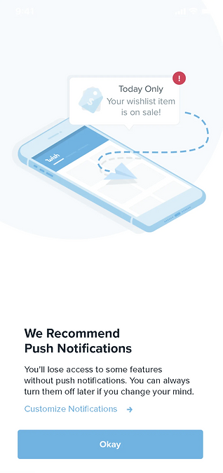
What I Did
-
Altered the headline and body copy to have a more accommodating tone
-
Added a way for users to access notification settings
Other Considerations
-
Some features require push notifications to work…
-
Wish works best with push notifications…
-
[Edit notifications]